

Sony TV channels undergo brand refresh with new look & feel
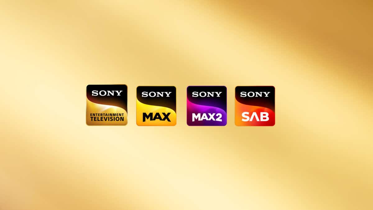
Sony Pictures Networks has unveiled a brand refresh with new logos and graphics for all of its channels and platforms.
As revealed earlier on BizAsiaLive.com, the new logos were testing after midnight for over a week, before they were rolled out today to coincide with Diwali.
The logos now follow the same look as SonyLIV, which was released to the public last year.
According to N.P Singh, MD & CEO, SPNI, “The power of the Sony brand and its values have driven our work ethics so far, and today, it reflects in our channel-brand architecture as well. The work that we started three years ago has now reached fruition. We are creating a powerful unified entertainment conglomerate with a broader appeal by refocusing our existing channel portfolio in its latest look and feel.”
Sony’s networks exist at the intersection of technology and entertainment – and the logos reflect this: the new branding colours are energetic, inspiring and remind us of a brilliant light spectrum. The curve in the logo comes from the swing of the Sony-S, with the dominant background being synonymous with the Sony brand. With this uniform shape and the associative play of colours, Sony has created a visual thread that connects the diverse family of Sony’s networks and reflects the 360-degree entertainment experience.
Keep it with BizAsiaLive.com for more.